Does anyone have a good way that you communicate to students how completion criteria work in a course?
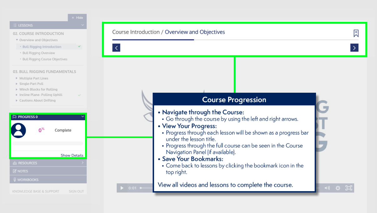
In Ti, a check mark and status circles can mean different things depending on the page type. We primarily use video and assessments as completion criteria but have found that a green check mark or bubble don’t communicate the same thing per page.
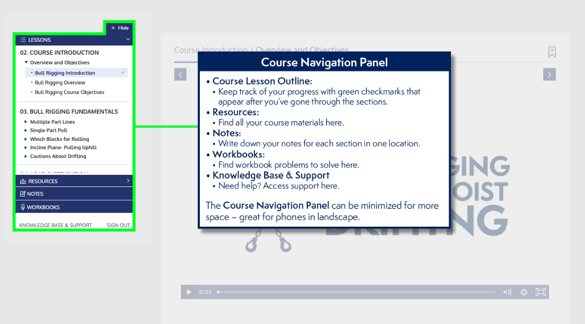
We’ve included a ‘Before You Begin’ slide-deck (a few examples below) to inform learners what tools are available in a course and we feel like completion criteria should be explained just as easily.


