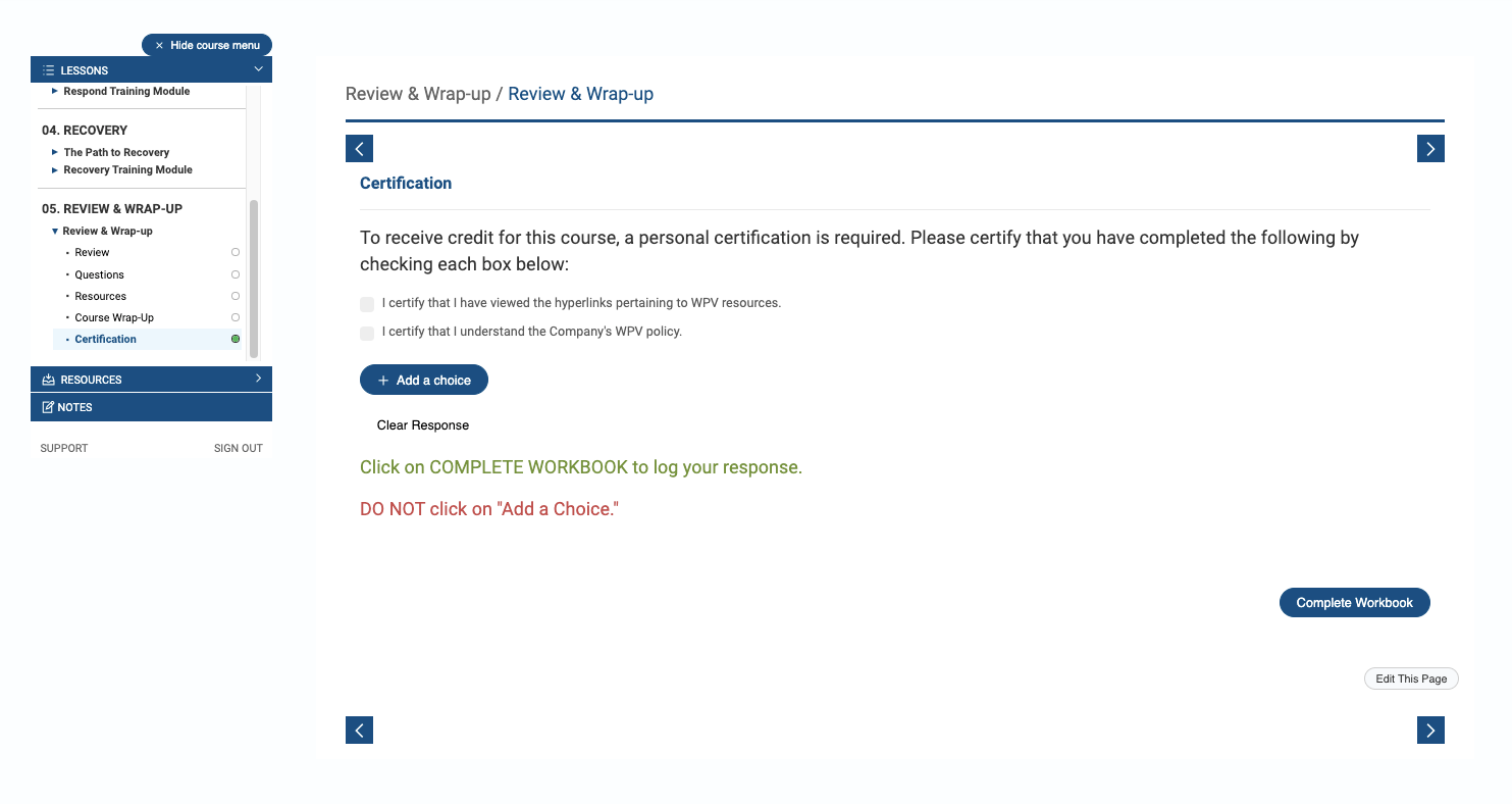
Hello, all. Does anyone use a learner self-certification to validate the completion of a course? I.e., “You must check the following boxes to receive credit for this course.” And the tie that to a completion criteria? I’ve tried using all the assessment tools (what’s available in my instance) but nothing works as I had hoped. The closest I got was using the Reflection / Select Boxes option but it won’t force the boxes to be checked even though I’ve selected “Prevent learner from progressing until reflection is answered.” See the images below. Anyone have a suggestions or know of a premium feature that does this effectively? Thanks!


Hi @Roze we use the Assessment feature. It’s not ideal, but it does work. We had to reduce the content viewed percentage from 90% to 50% because learners were struggling to complete the courses and receive their certificate when we first launched so our learning design team made some changes to the configuration. 

We’ve run external user testing on our site and some users have had issues understanding what they need to do when they get to this bit but the majority of the time it works well. Our UX agency that ran the testing asked us to look at changing the messaging so it’s clear to learners.


Interesting concept,
I would say the Quiz Page might be a better option that Reflection as it can be auto graded to meet the completion criteria. Quiz will also go into reporting while reflection would not. 


@Roze We do this for field evaluations where the detail of the event is more than we need so we build a quiz with the question, “I have completed X in the field and my instructor believes I am qualified.’  Options are Yes, No, Uncertain.  Hope this helps.


Thanks, everyone! @charles.zimmerman @Philcahill87 is there a way to change the “Quiz” and “Start Quiz” button using CSS? Maybe so it says something specific to the application like, “Personal Certification”? This is splitting the baby, I know. I can see the client reviewers asking, “Quiz? What quiz?” before actually moving forward. Appreciate the quick responses from all!!


@Roze Yes that can be easily changed in either translations or CSS.  Start in translation.  I suggest you don’t change it or it will say that for every quiz.  Instead. I would use a start of quiz message that clearly outlines what is about to happen and why.  People don’t read the web.  They click on it, about ever 1.5 seconds according to Google.  You can aslo try adding custom CSS to just that one course?  I have not tried that with a button but it could work.


@LauraFort_ETF001 That looks clean. Precisely what I need. How do you preempt that page? Which assessment page type are you selecting? Looks like Quiz/ Multiple Choice..?


@LauraFort_ETF001 My only concern would be that there is no “opt out answer”.  My only choice is that I finished the course.  What if I did not and I would like to say so?  I have even played around with allowing one answer to be “Contact me for more information”.  Some folks WILL NOT sign off on the course because they found mis information in it.


Reply