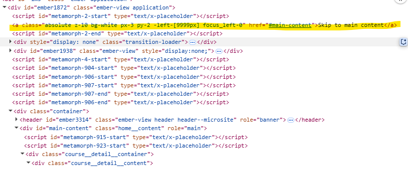
There seems to be something new on the learning path pages, both as a manager and as a learner. I logged into today to see this “Skip to main content” link overlaid randomly on the detail page of the learning path. When you click it, it bounces around.
Are other people seeing this new link or is it just me? It doesn’t do anything and is also obstructing the images and other divs as it’s absolute positioning. If this is a new, permanent feature, I’d want to hide it. But if this is a glitch, I’d like to know if others are also experiencing this.
I know we’ve used the “.learning-path .absolute” class in our global code for other purposes, but this link is totally new.
Page 1 / 1
HI @JayBo
I have converted this to a Support ticket so the technical team there can look into the CSS and see what is causing this to appear.
Can i check if the CSS you have shown above is your own CSS or if this is default TI CSS, and if it is custom have you tried commenting it out to see if that removes the text with the link?
Kind regards
Jon
Good morning! I just checked the Learning Path pages again this morning, and that link is now gone- visibly, at least. It’s still in the backend code (see attached picture), but it looks like a new class was added to it to push it -9999px to the left, off screen. It exists near the top level of the page, outside of the main content container, so it’s most likely a TI script loading it. Feel free to snoop around, but it’s not a code we’ve added or control.
This link exists on both the learning path detail page and the learning path content page. Is there a built-in TI functionality that is supposed to load this button to allow you to jump to the “main-content” id? Which is weird, in my opinion, since the entire page is wrapped in the main-content id, so you’re already looking at it, which is why that button wasn’t taking me anywhere.
Hi there. “Skip to Content” button are used for accessibility purposes, usually by those who navigate via screen reader. It skips the element in focus right to the page container so that the user doesn’t have to tab through all of the links within the side nav menu before they get to the actual/main content of the page they’re viewing, like flash cards, discussion boards, quizzes, etc. It should be visibly hidden by default, but once it comes into focus it becomes visible. Here are some resources if you’d like to read more: