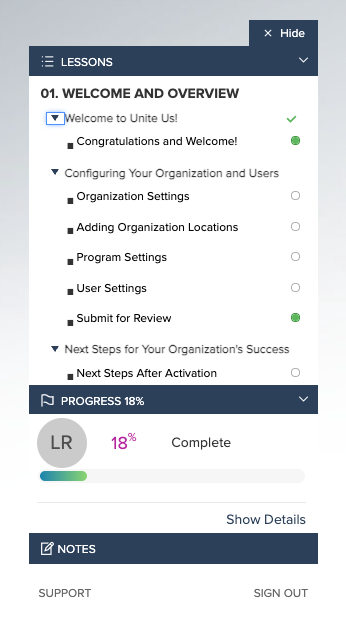
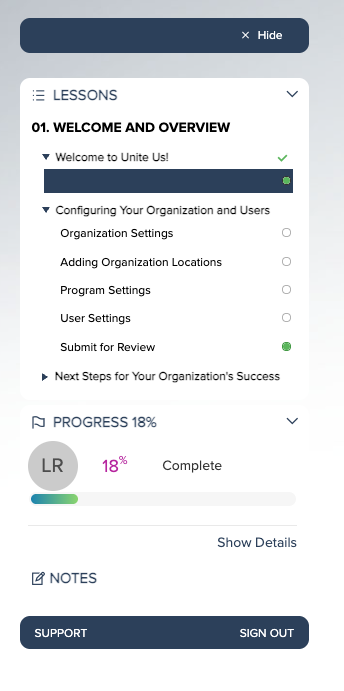
I like the Example 1 and would like to implement it, but when I do, the text of the pages in the menu gets even smaller and is hard to read.
How do I change the page titles to a bigger size in the menu bar?
This code affects all the menus within content, so I would want the menu bar text to be adjusted for every piece of content. I just don’t see where to adjust that in this code snippet.
Hi
Could you please send me a screenshot of what change you made and what you are seeing, along what you are trying to achieve and I will see if I can offer any advice.
Heads up though as I am not a CSS guru but i will do what I can to get the info you need.
Kind regards
Jon
So, here is the original look - where I also think the text is too small in the menu, but have never known how to fix it.

And when I put in that code with our colors - It feels even smaller (the highlight is the same color, so I need to adjust that) But, the text is very small to try to read the page titles. And is there a way to have it automatically open each section/lesson grouping instead of opening with them all closed?

Hi Lisa,
The Code does not impact the size but you can add a font-size in if you want to make it bigger. Swap or add the code below.
Please adjust the font-size pixel (20px) to what you need.
Code provided for Section Title:
.learner__sidebar-inner-list span.syllabus__section-title {color: black; margin-bottom: 1em;}
Edit to increase font:
.learner__sidebar-inner-list span.syllabus__section-title {color: black; margin-bottom: 1em; font-size:20px;}
Code provided for Lesson Title:
None
Edit to increase font:
.learner__sidebar-inner-list .syllabus__lesson .syllabus__lesson--title .syllabus__lesson--title-text {font-size: 16px;}
Code provided for Page Title:
.syllabus__topic--non-expandable .syllabus__topic--non-expandable-title-text { margin-top: 2px;}
Edit to increase font:
.syllabus__topic--non-expandable .syllabus__topic--non-expandable-title-text { margin-top: 2px; font-size:14px;}
Example with font-size changed
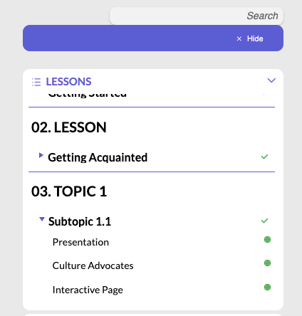
That worked perfectly,
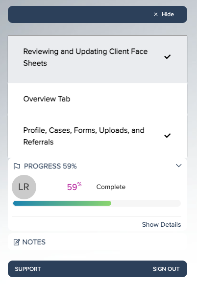
Now, next question is how to adjust the Microcourses to match? It rounds off the Progress section and separates from the top bar with the hide option, but the Microcourse pages are not rounded off and now the bottom of the list of pages blends into the Progress section, so it is hard to see where that ends and the progress begins. Any thoughts on how to address that?
Thank you!

Hi Lisa,
The menu of the Micros-course is different CSS classes.
Ill add this to my up-next queue and try get something out in the next week or two if you can wait.
Just need the time as we are working on a few others CSS blocks about to be release.
Once I have the Code I will place here so you can heave it before the documents are ready to go live.
Thank you! I am loving the Code Library - for those of us who don’t have a web dev on our team, it makes a huge difference. I know just enough to fix and ask questions, but don’t write it myself, so this is exactly what I needed.
Thanks!!
Reply
Enter your E-mail address. We'll send you an e-mail with instructions to reset your password.