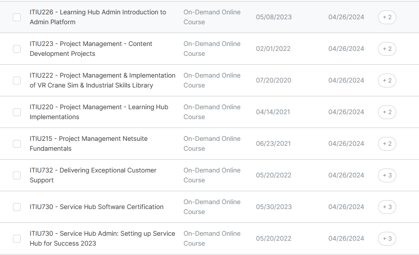
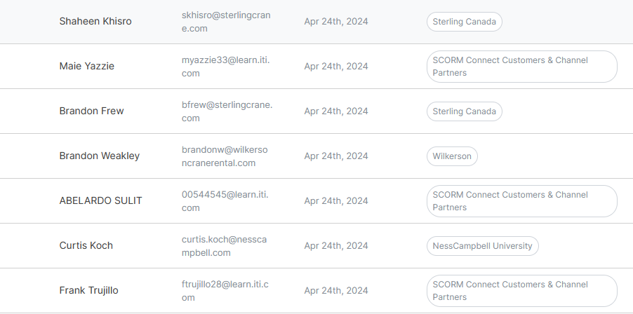
We wanted the default of all Admin Nav tables to be auto expanded to full width. Names and titles and Tags were getting cut off or spilling over. Here is what I have come up with so far to get this result. This will make the column view full width for Users and Full Row Height for Content and Users. Enjoy.
/* Maximize Manager User container full screen. 4.26.24 */
.manager .section-container {
  max-width: 1298px;
  margin-left: auto;
  margin-right: auto;
}
.flex-table__col--tooltip {
  white-space: normal;
}
.tag-pill {
  display: inline-block; /* or display: block; */
  /* Optionally, you can also set a maximum width or width to control the wrapping behavior */
  max-width: 100%;
}

  /* width: 100%; */
}
.user-table__container {
  display: word-wrap;
}
.flex-table__col .flex-table__col__wrapper {
  /* Allow the content to wrap */
  white-space: normal;
  /* Expand the height of the row to fit the content */
  display: inline-block;
  /* Optionally, you can also set a maximum width or width to control the wrapping behavior */
  /* max-width: 100%; */
  /* width: 100%; */
 }
  .flex-box {
  display: flex;
}


